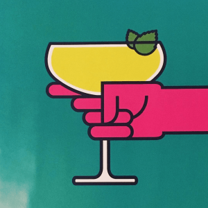
This is my favourite image from the ones that I took. It is taken from the Revolution bar’s promotional poster that says I <3 Vodka. The reason I picked this image as my favourite because I really like the colour scheme and the simplicity of it. I like how the main subject is central to the frame and is mostly straight. I think it’s a good example of appropriation because if I had not said, then it would not be obvious that this was part of Revolutions promotional poster, as it stands well on its own as a piece of digital artwork.
If I were to try and take this picture again, I would try to get it so that the light was not shining directly on it, to get rid of the lighter part at the bottom right. I could also probably fix this in Photoshop but that’s not part of this project.
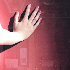
This image was posted by user:katherinechisham. The reason that I like this image is because I think the colours are very aesthetically pleasing, the main colour of red is very well complimented by the subtle orange and pink tones as they are all complimentary colours. I also like that you can see the reflection of buildings in the image, and even the top of someone’s head, as it is a subtle reminder that this project is about using other people’s images and appropriating them to create something your own.

