Workshop
In our workshop in week 4 we experimented taking still life photographs in groups; I was in a group with India Hicking and Jen Dennison. Below are some of the photos we took together.
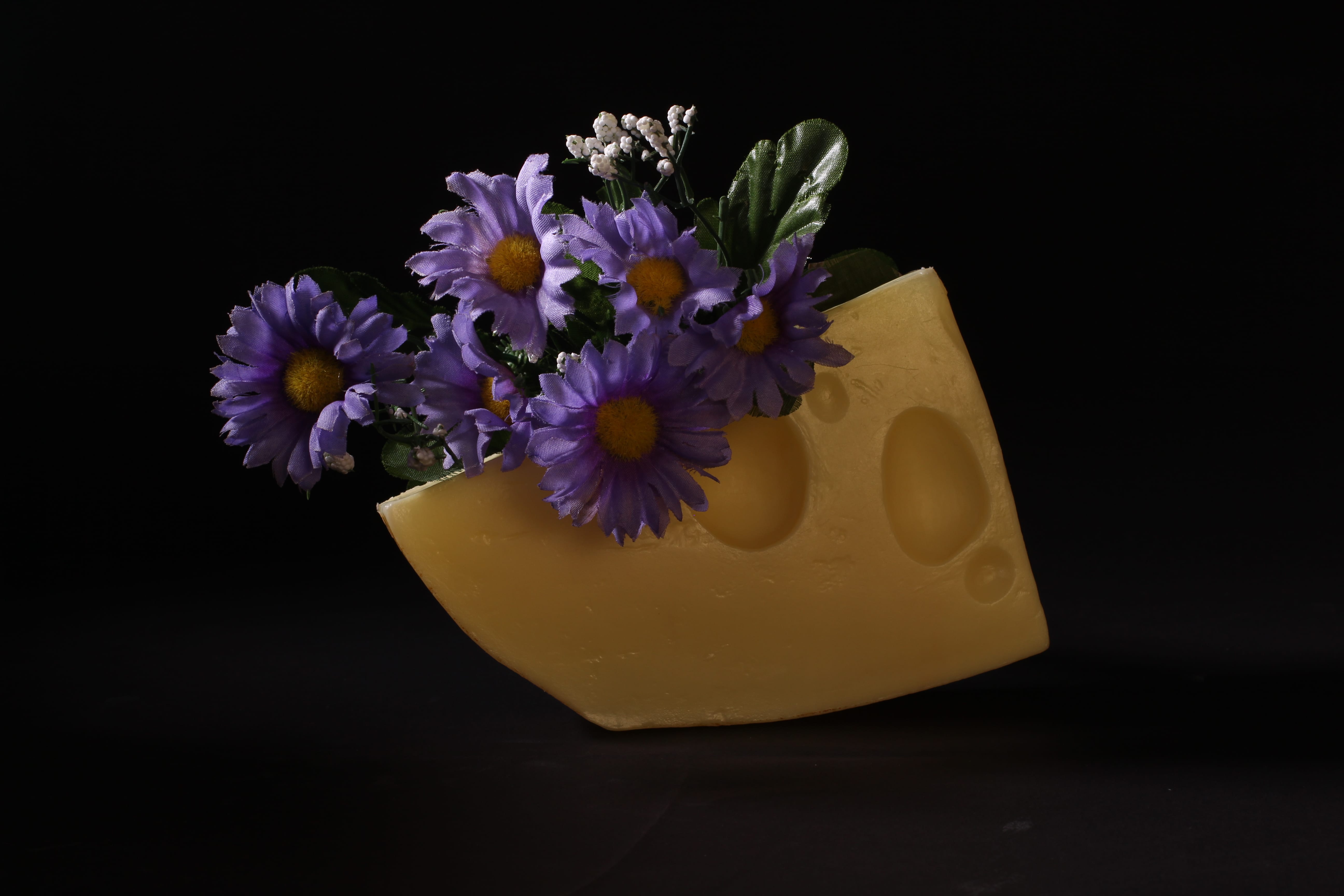
I really like how these two pictures turned out, they are the best out of the dozens that we took. I like the first one because of the chiaroscuro lighting that we managed to accomplish. I think that one way we could’ve improved the first image would be with a sharper focus, as we were quite rushed to take that image at the end of our session, so we didn’t notice that the focus was just marginally out. I also like the second image, and we took this earlier in the session. I like that we managed to perfectly flag out the background, and subtly reflect some light onto the darker side of the cheese to light it up perfectly. I also like the colour scheme, as purple and yellow are contrasting colours and opposite each other on the colour wheel, so they look nice together. This is why we decided to take the picture on a black backdrop, so as not to distract from the colour harmony.
After this workshop I decided to do some research into still life photography, especially of flowers.
Research
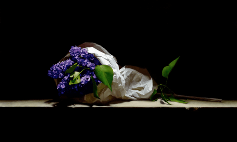
Firstly, I found this image by Richard Murdock. I like the theme of flowers and I know I can access flowers to take picture of for my final photo because there are some in the media building. I also like the colours shown in this photo and how it is on a black background, I think a black background really lets the subject speak for its self and does not take anything away from it.
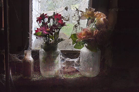
Another photograph I found was Frederick Sommer, who takes pictures of found objects and scenes, and this is one of my favourite photographs by him. I like this because of the soft lighting, and the contrast between the light parts in the centre and the dark parts around the edge, it really adds to the feel that the image is glowing. I also like that Sommer has used fake flowers like I did in my practice photos, because I feel like I can relate this to my own work.
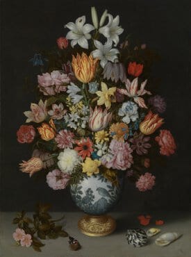
I decided to keep with the theme of flowers within still life and found Ambrosius Bosschaert the Elder, who is an artist from the 15-16oos, with a very cool name. Although he is not a photographer, the concept of still life came from art, and during his lifetime the camera didn’t even exist, but his art will have inspired still life photography in later years. This painting is again of flowers and has a slightly different lighting style to my other pieces of research, the lighting here is more direct, but not front on as there are still some subtle shadows on the right. Again the light seems very soft and makes the image look soft. This is a very complex and busy image, and I don’t think I could recreate something with this amount of flowers in because I really would not know where to find them, but still I do like how busy the image is.
Final Still Life Image
The following are images I that took for my found object project this week, that I decided weren’t up to the standard I would’ve liked.
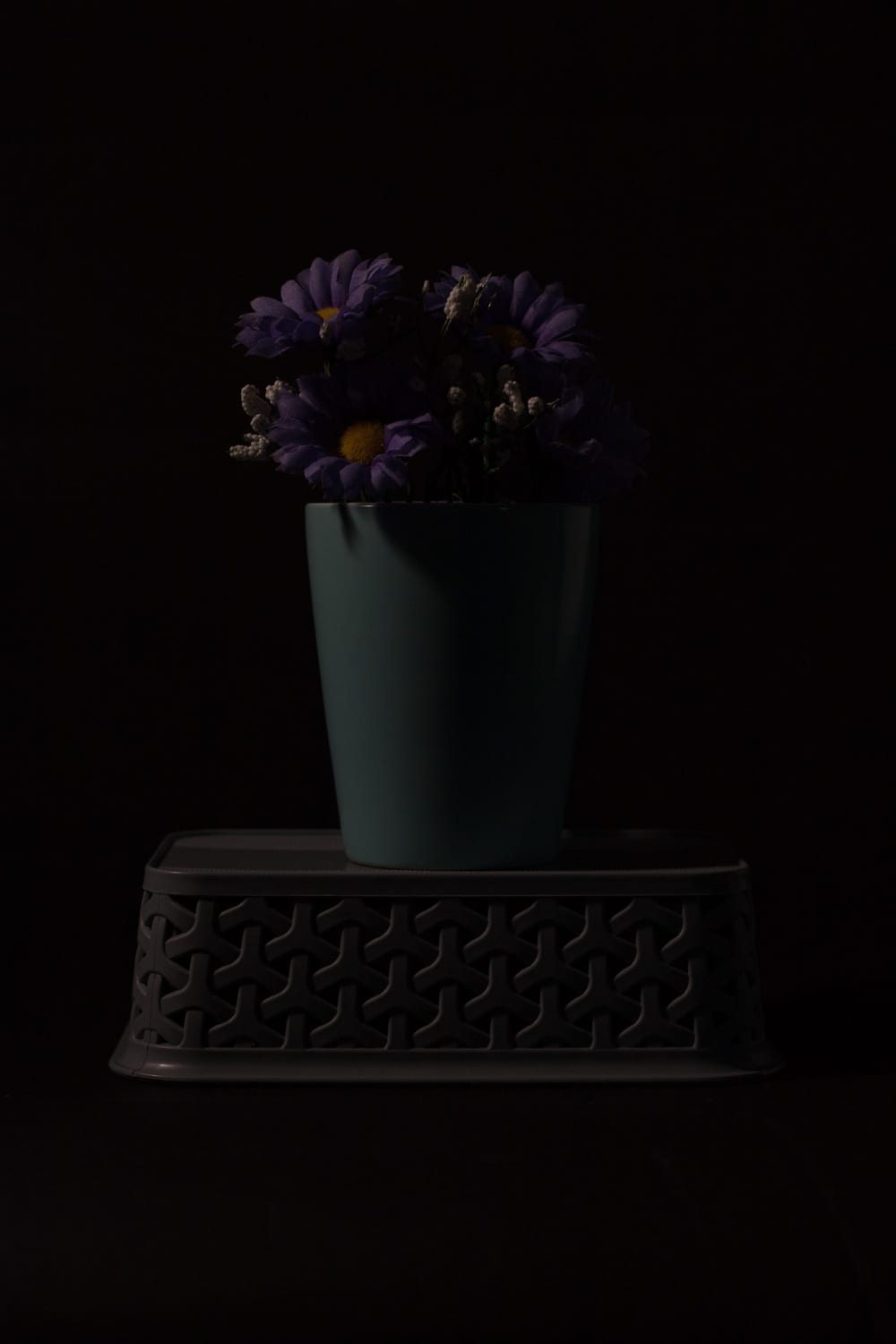
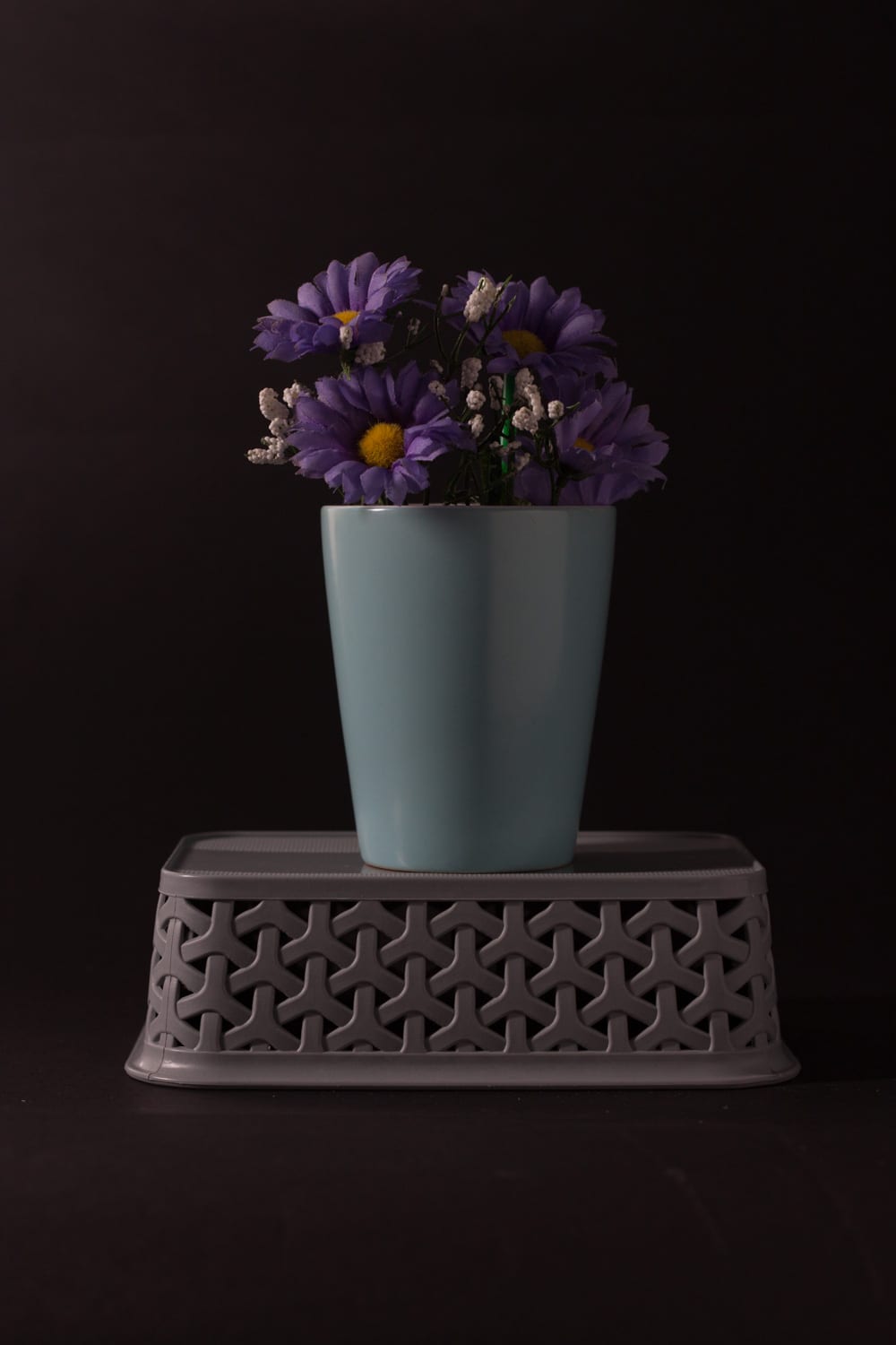
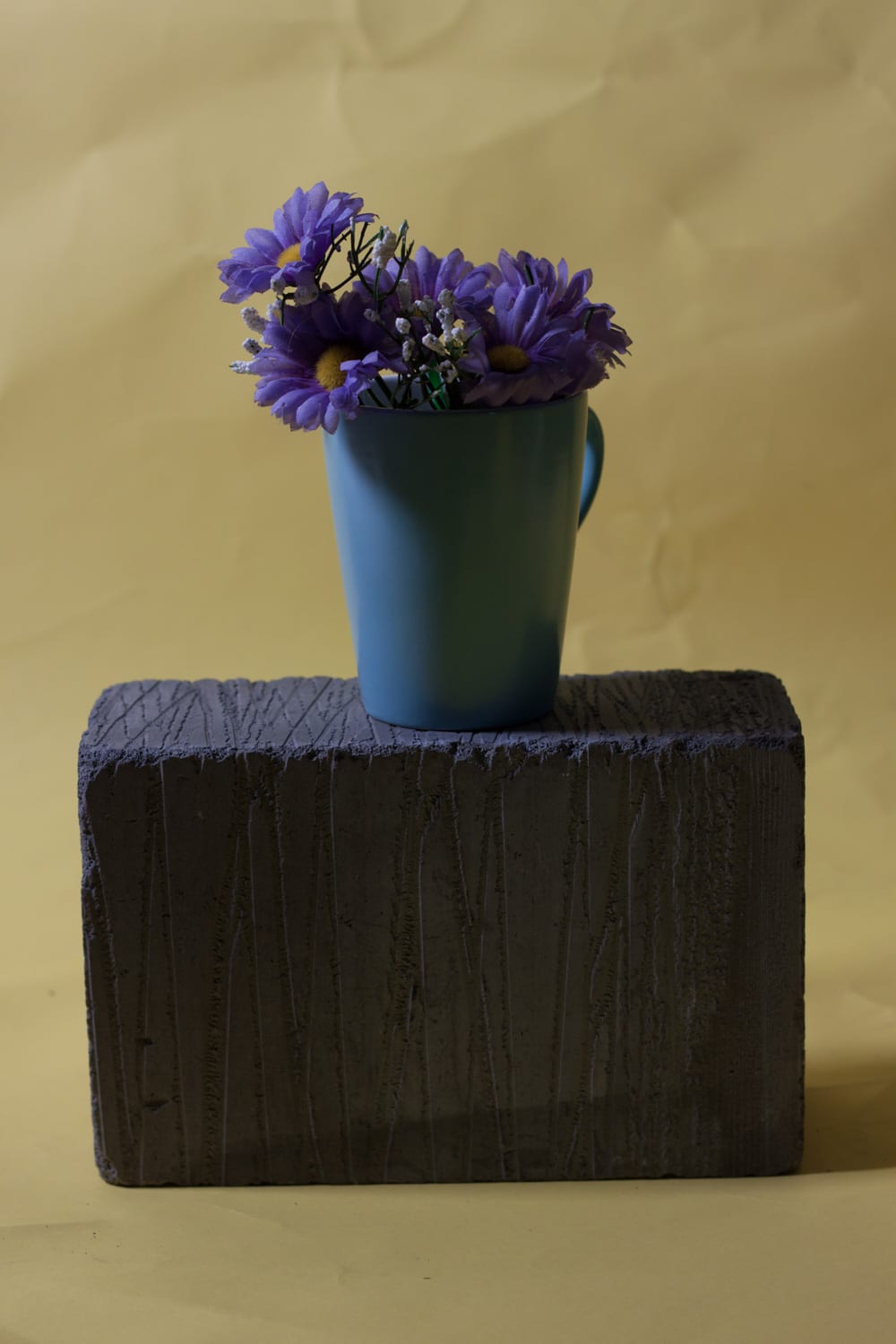
The reason I didn’t like these images was that none of them are lit how I would’ve liked. I quite like the lighting on the subject in the third image, but I did not flag the light to make the background darker, so the black background appears very grey which I do not like. The lighting in the second image is not terrible, the subject is very well lit, but its just not as dramatic as I’d like.
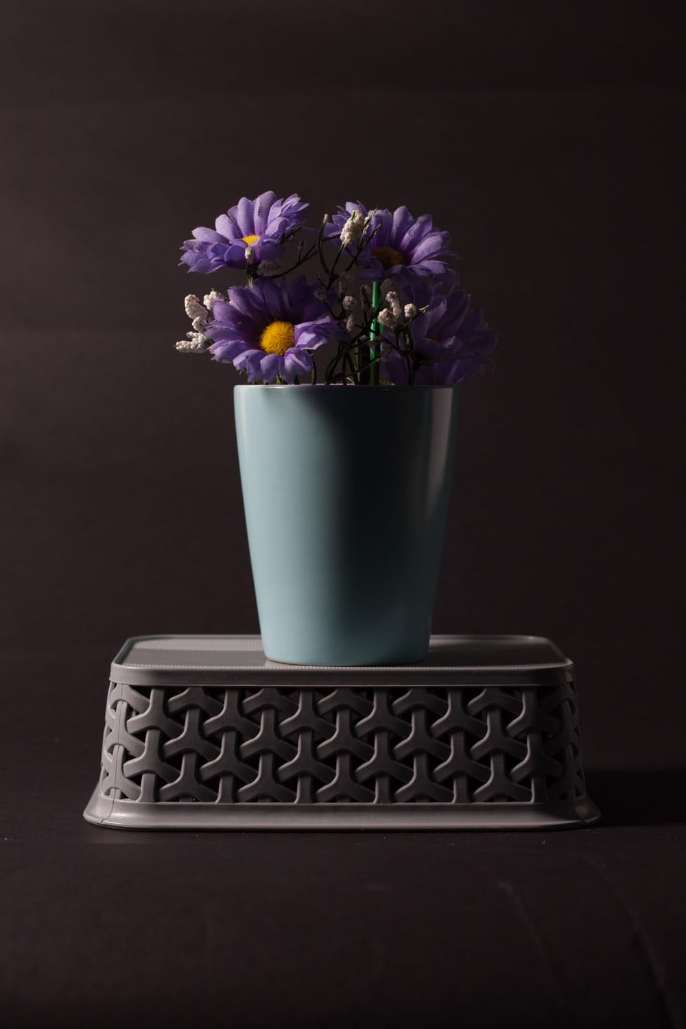
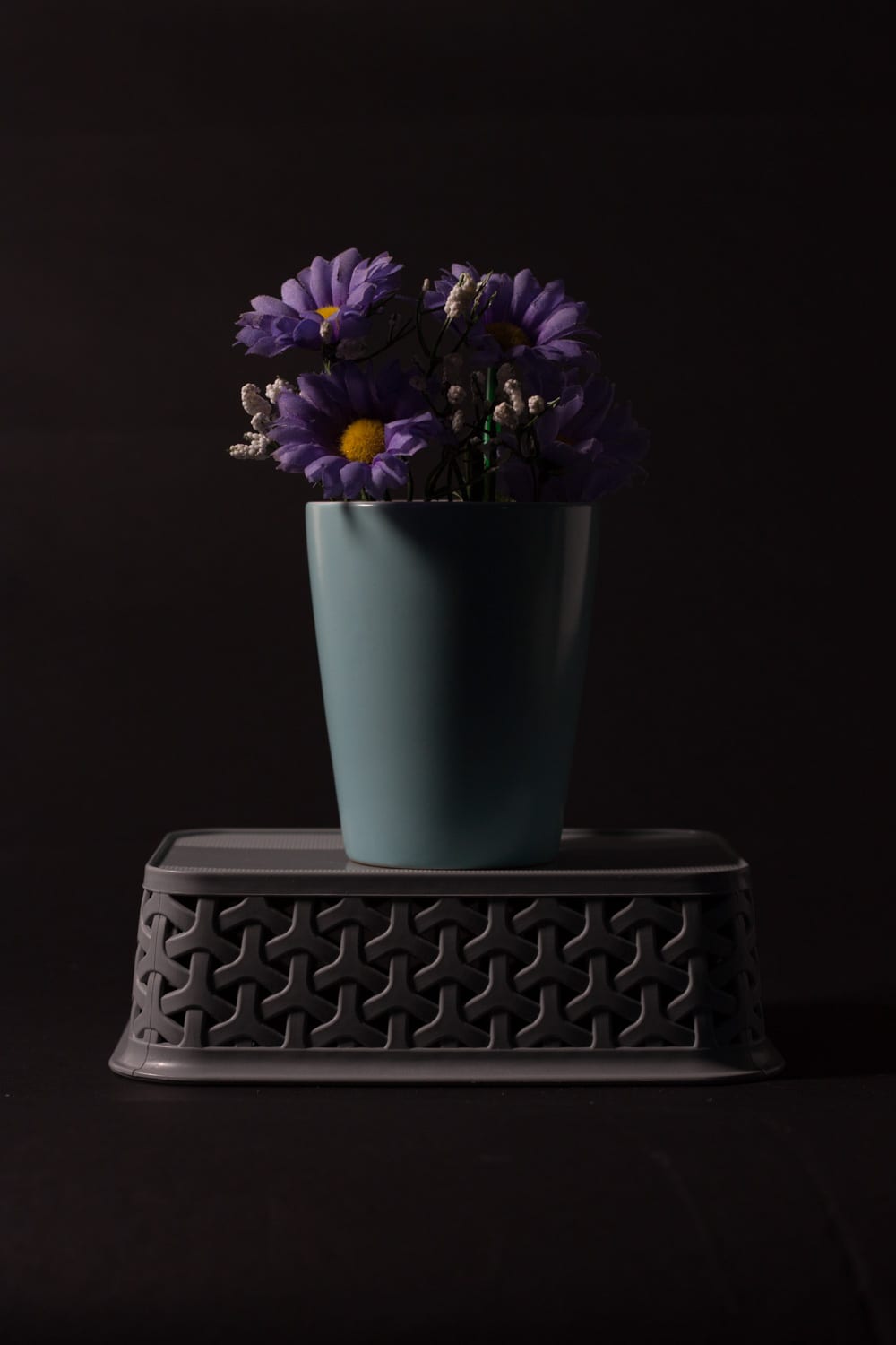
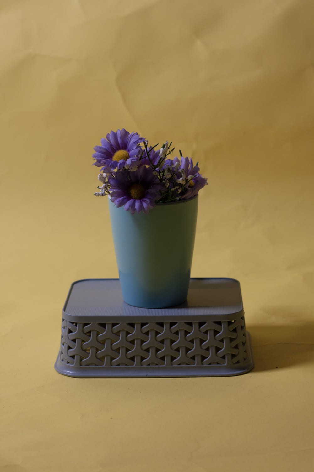
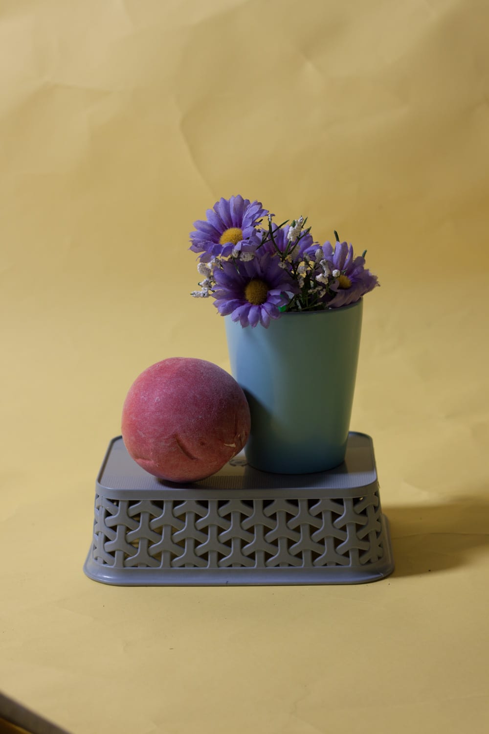
The following two photos were part of my final few that I liked, but aren’t my final image.
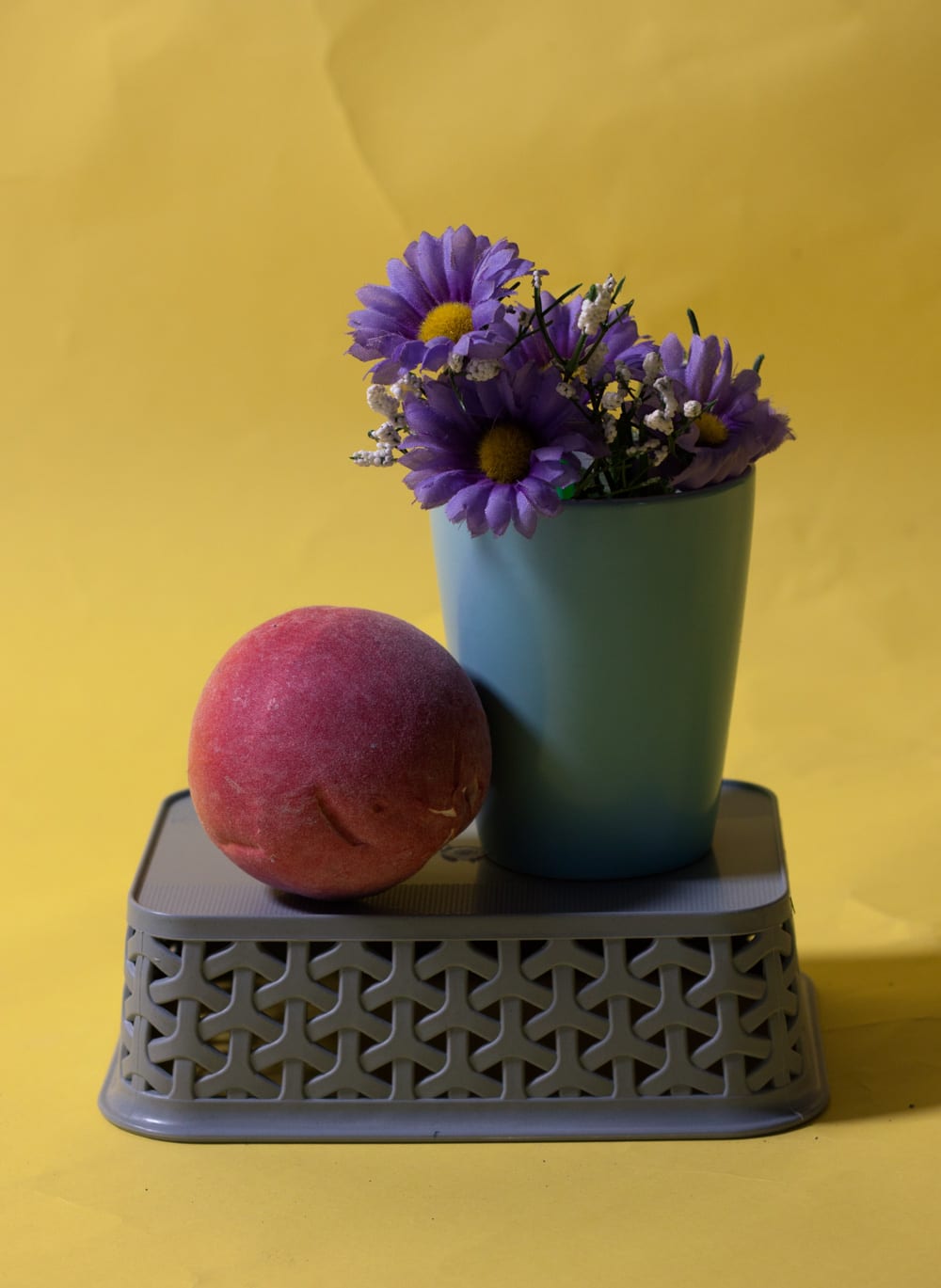
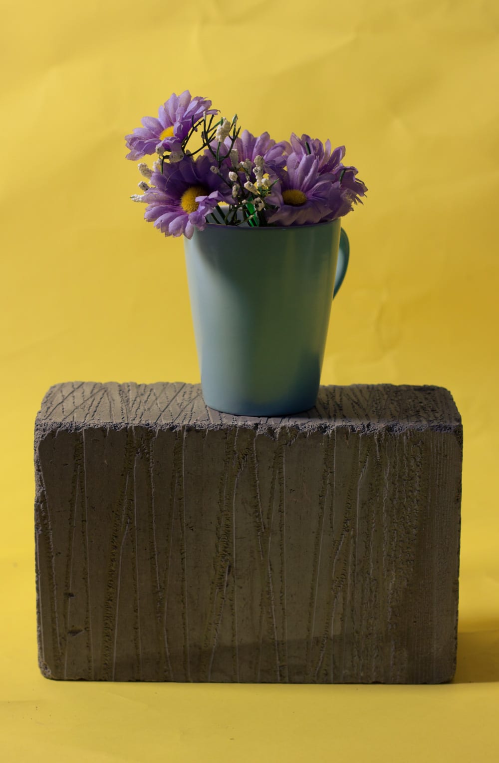
I liked both of these images, but the one on the right is proably my favourite. The purple and yellow compliment each other because they are opposite on the colour wheel, and the blue is one of purple’s analogous colours so fits well too. The image on the left was just experimentation with more props, but I like the composition of the image which is why it made it into my final favourites. It also has more shadows which I like because it adds depth to the image.
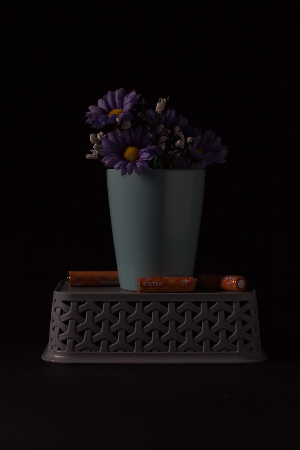
Lastly, here is my final image for my ‘Found Objects’ project.
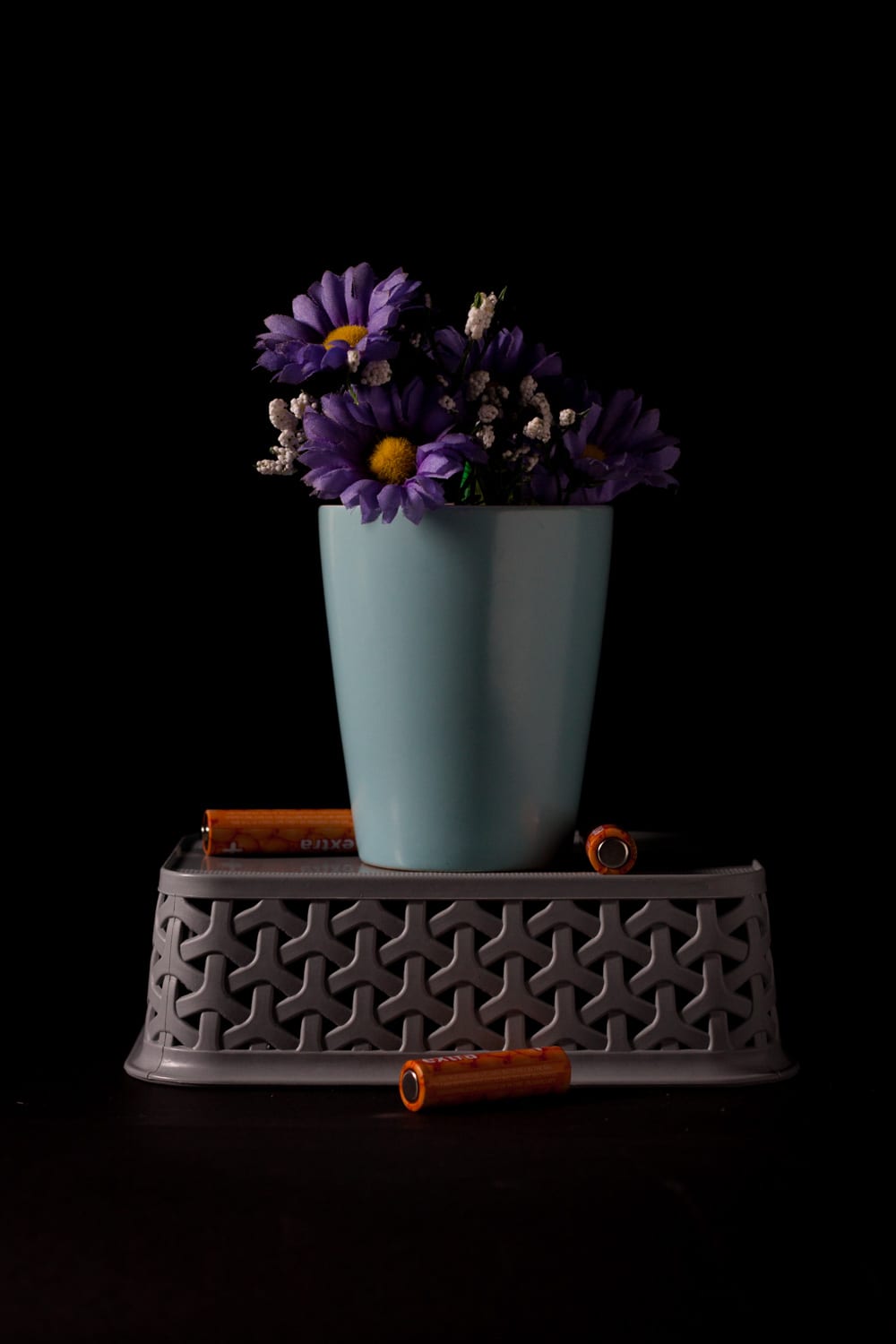
The reason I chose this image as my final image is because I think it displays the best lighting, colour scheme and composition of all of my images.
I managed to flag out the background so that the black stayed a dark black instead of turning grey. I also had the light source to the side of the subject so that one side got most of the lighting, but to make sure that the other half of the image was also visible, I reflected a small amount of light onto the other side.
The colour scheme I have gone for in this image is a split complementary scheme, with a light blue, purple and orange. At first, I just had purple and blue, but I think that the orange batteries really add a pop of colour and to the image.
I also think that the batteries help break up the composition a little bit. Without them, the image was very perfect and aligned, but they are dotted around randomly and I really like what this adds to the image.
Finally, I prefer the subject on the black background because it does not distract from the subject; it is just dead space.